


Pulkovo Heights
Client
Pulkovo Heights
Services
Competitor analysis
Logo
Form style Copyright
Form style Copyright
Ice energy
In the summer of 2022, it was planned to open a new ice arena in St. Petersburg. This is a unique project as it represents one of the largest in the Pulkovo district (more than 2270 m2). Its creators turned to us for the development of a corporate identity in order to attract novice athletes and their parents.
Pulkovo Heights is a modern ice complex with a multifunctional infrastructure (leisure areas, wellness treatments, co-working spaces and cafes). Experienced coaching staff, sports sections and cooperation with the school of the Olympic reserve allow hockey players and figure skaters to develop their skills.
The inputs
The company came to us with a ready-made platform and naming. However, the latter raised several concerns. Legally, Pulkovo Ice competed with Pulkovo Airport and ice arenas already using the word "ice".
The company came to us with a ready-made platform and naming. However, the latter raised several concerns. Legally, Pulkovo Ice competed with Pulkovo Airport and ice arenas already using the word "ice".
This problem hindered development as if the site entered the market, competitors could sue it in the future. Worried about the future of the project, we submitted the name for review, and the patent confirmed the risks for registration.
Further, together with the client, we studied alternative options. As a result, the name "Pulkovo Heights" was chosen. It was with him that we continued the project.
Naming criteria
1. Most of the images are blurry and not unique.
2. There are two traditional vectors: outdated solutions with an emphasis on nostalgia and American flair.
3. The colour palette refers to the Russian flag. Blue, red, white colours prevail.
2. There are two traditional vectors: outdated solutions with an emphasis on nostalgia and American flair.
3. The colour palette refers to the Russian flag. Blue, red, white colours prevail.
Audience
The project has a diverse audience. These are athletes of different levels of training (beginners, amateurs and professionals) from 3 to 55 years old plus. These are also parents for whom the development of the child is important. When developing, it is crucial to find a balance and reflect it in character.
The project has a diverse audience. These are athletes of different levels of training (beginners, amateurs and professionals) from 3 to 55 years old plus. These are also parents for whom the development of the child is important. When developing, it is crucial to find a balance and reflect it in character.
Design idea
Together towards the same goal
Hockey is a team game. There is a crucial general atmosphere here, because only together victory can be achieved. That is why we reflected the idea of cohesion in the design. All together (hockey players, figure skaters, their coaches, complex employees as well as fans) turn into a force that cannot be stopped.

Design
The logo consists of a typeface and a sign — a stylised image of a hockey stick and a puck. Each element is individually assembled into a pattern consisting of two types of graphics: shapes resembling scoreboard pixels, and lines depicting tactical actions used by coaches in preparation for the game.
The logo consists of a typeface and a sign — a stylised image of a hockey stick and a puck. Each element is individually assembled into a pattern consisting of two types of graphics: shapes resembling scoreboard pixels, and lines depicting tactical actions used by coaches in preparation for the game.


The elements are combined into a single form, which, depending on the context, translates a different meaning.
Confidence, clear lines reflect the movement towards the goal, the dedication to win, symbolise the tactical actions used in preparation for the game.
The pattern simplifies the brand development: the design system can be adapted to different formats.
The clean palette is within the framework of the industry’s solutions, but at the same time it looks more modern, fresher and a little digitalised, which allows us to emphasise the manufacturable side of it.
The corporate identity of the company looks bold and modern. At the same time, he remains friendly and open, which reflects the nature of the site and the people inside it.
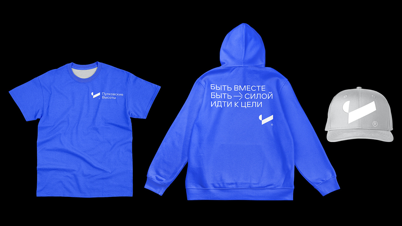

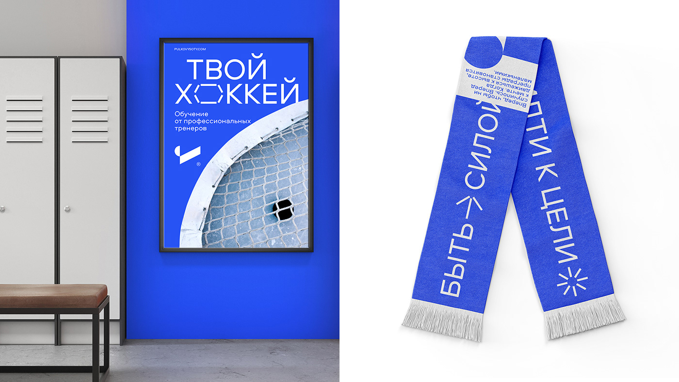
As part of the project, we developed a communication that supports the active nature of the brand. It is reflected in merchandise (tote bags, scarves, control bracelets) and bright posters with motivational slogans that are designed to boost the morale of athletes.
The communication in social media layouts appeals directly to the audience: young and professional hockey players and figure skaters. At the same time, the style allows us to talk about the main advantages of the complex: manufacturability, modern infrastructure and professionalism of the coaching staff.


The results
1. We developed an identity for a new ice complex
2. We emphasised the manufacturability and modernity of the brand
3. We rebuilt the brand from competitors and conveyed the emotional character
2. We emphasised the manufacturability and modernity of the brand
3. We rebuilt the brand from competitors and conveyed the emotional character


